
If you previously preferred browsing old.reddit for its compact and information dense web layout, you should know that this theme can be replicated for Lemmy using monkey scripts.
For more information on installing browser extensions to use scripts linked by this post, checkout:
- https://greasyfork.org
- https://violentmonkey.github.io/
- Recommend given recent context:
- https://news.ycombinator.com/item?id=34830903
Has anyone considered forking or talking the RES developers into doing something for Lemmy/kbin?
Checking the issues tracker for RES, there’s not yet any mention of lemmy or kbin:
Perhaps you could ask there. I’d also recommend checking out the Lemmy Plugins & Userscripts community:
He’s active on Tildes and said just a week ago that he doesn’t have another one of those plugins like RES in him :)
Very nice. I don’t understand the paradigm where everything is spaced out and there’s useless sidebars wasting space.
I general why does there have to be static sidebars that are rarely used. It causes the content body to be squeezed into tiny space. I will use the left menus when necessary which is not every single page view. In particular the right panel on lemmy and reddit have become cognitive blindspots. I will read the board description and decide to (or not to) click subscribe once. Otherwise it’s like how my brain ignores my own nose.
Why did web design become this way?
I had a “hide sidebar” bookmarklet for Reddit that lived in my favorites bar and got used dozens of times a day. I didn’t mind so much when Reddit was fullscreen, but when I was cramming it in with other windows on my desktop that extra real estate made a huge difference.
Personally I see the value of the sidebar but I think it would work better as a fly-out UI element that can be reduced or hidden, and stays that way until opened up again. I’m in the process of trying to stand up my own instance to see how that could be done.
I general why does there have to be static sidebars that are rarely used. It causes the content body to be squeezed into tiny space.
I think the rationale is that most people use widescreen monitors nowadays, so if you allow the content part to run across the entire width of the screen, it becomes ugly and hard to read. Therefore the middle section gets a limited or fixed width, which in turn then creates two empty columns to the sides that designers are then tempted to fill up with “useful” stuff.
You can try this yourself: paste a long line of text into a notepad window and maximize the window. It is much harder on your eyes to read and focus on the text than if you resized the window to a more reasonable width where the text gets broken up into several lines.
I’m not against this design paradigm per se, but the content width reduction is often overdone, leading to a squeezed feeling like you say. It can also create problems if you have a habit of not using maximized browser windows, but for example a window tiled to one half of the screen. Some of the better sites work around this by having a reactive design that reduces, collapses or removes the sidebars when the window is narrower than a certain width, but many sites don’t.
these are excellent, though it is missing a little padding to the right of the thumbnail for me using
old.reddit.compact.user.js. But it brings up usability for me.I wonder if lemmy will have a theme engine eventually. Or an old-reddit theme…
Check out this issue:
It does have a theme engine. It uses bootstrap v4 theme files. Problem is, bootstrap is now on v5 and the themes generated by bootstrap.build are not compatible with v4.
So we need some good themers to show up. :) (And maybe some good UI people as well)
Do you have any links or references to learn more? Perhaps any github tickets to follow? By bootstrap, are you referring to this?
Thanks for sharing!
There’s no need to go JavaScript route for theming, Stylus is an add-on that injects CSS instead. I wrote a style here, which increases width of Lemmy instances for wide screens, and also respects your browser light or dark theme if set to follow system:
https://userstyles.world/style/10233/zettajon-1440p-and-darkmode-supported-lemmyFor posterity, I later stumbled upon the authors original post here:
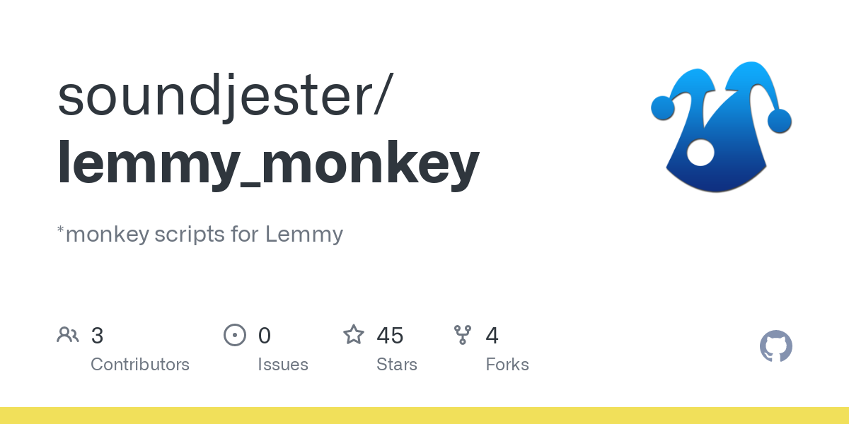
- Tamper/Greasemonkey script to reformat interface to a style recalling old.reddit
The community that this was posted from also looks interesting:
- Lemmy Plugins & Userscripts
This makes lemmy more usable than kbin for me