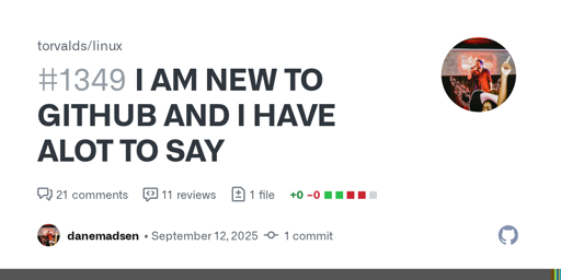
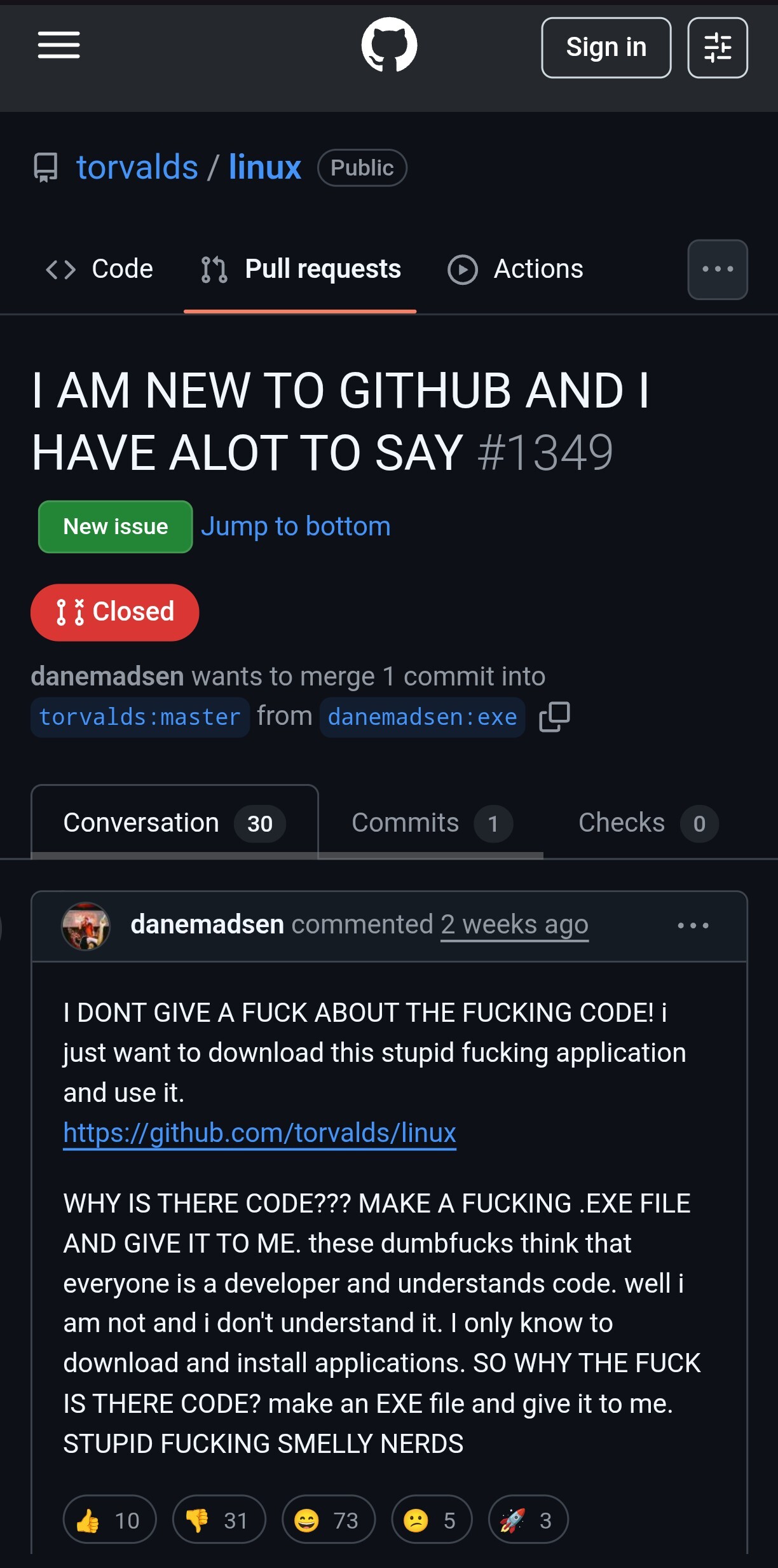
I DONT GIVE A FUCK ABOUT THE FUCKING CODE! i just want to download this stupid fucking application and use it.
https://github.com/torvalds/linux
WHY IS THERE CODE??? MAKE A FUCKING .EXE FILE AND GI...
Looking back, I find every single aspect of the 2018 design more accessible than the current one. Releases are above the fold, the list of forks is reachable by clicking the number next to the fork button, the explore link is right there in the top navigation. Sure, having three levels of horizontal navigation doesn’t look very clean but there must be a better solution than hiding everything in hamburger menus and sidebars where you can only find them if you already know they exist.

Looking back, I find every single aspect of the 2018 design more accessible than the current one. Releases are above the fold, the list of forks is reachable by clicking the number next to the fork button, the explore link is right there in the top navigation. Sure, having three levels of horizontal navigation doesn’t look very clean but there must be a better solution than hiding everything in hamburger menus and sidebars where you can only find them if you already know they exist.