

From the same guy who brought us spurious correlations, a fun way to show that correlation is not causation via graphs of correlations between very different things that do not cause each other.
I did attach an image but because of a Lemmy/Mbin issue I don’t think I can have actual alt text, so here is the alt text.
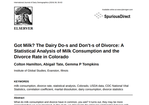
A website, whose title is “spurious scholar”, with the subtitle “Because if p < 0.05, why not publish?”
Step 1: Gather a bunch of data.
Step 2: Dredge that data to find random correlations between variables.
Step 3: Calculate the correlation coefficient, confidence interval, and p-value to see if the connection is statistically significant.
Step 4: If it is, have a large language model draft a research paper.
Step 5: Remind everyone that these papers are AI-generated and are not real. Seriously, just pick one and read the lit review section.
Step 6: …publish:
Then there are two screenshots from papers generated with this method.
Also, clicking the note for step 2 has some pretty educational content on being naughty with data, at least for me, someone who is not an academic:
“Dredging data” means taking one variable and correlating it against every other variable just to see what sticks. It’s a dangerous way to go about analysis, because any sufficiently large dataset will yield strong correlations completely at random.
Fun fact: the chart used on the wikipedia page to demonstrate data dredging is also from me. I’ve been being naughty with data since 2014.
Obligatory xkcd demonstration.
Every topic of interest has a relevant XKCD. Conclusion: We are incapable of gaining widespread interest in a topic until an XKCD has been written about it.