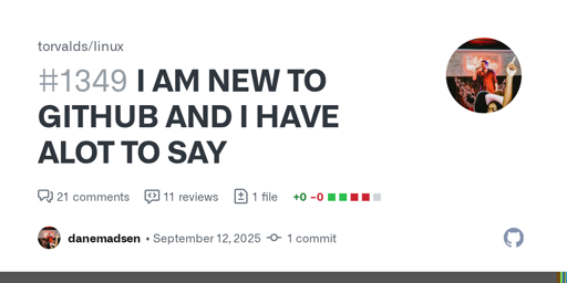
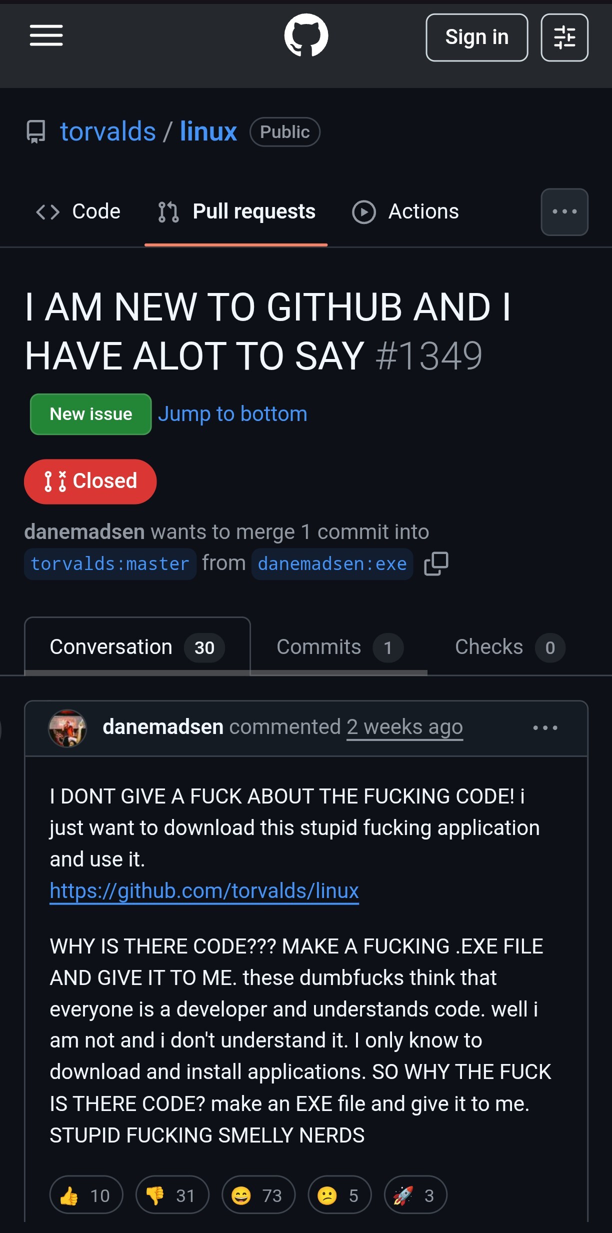
I DONT GIVE A FUCK ABOUT THE FUCKING CODE! i just want to download this stupid fucking application and use it.
https://github.com/torvalds/linux
WHY IS THERE CODE??? MAKE A FUCKING .EXE FILE AND GI...
If I remember correctly, they used to be in a tab in the top navigation, together with “Code”, “Issues”, “Pull requests”, etc. which was a lot easier to find for people who are not familiar with GitHub’s UI. Edit: it was a separate bar right above the file list, together with the number of commits and branches: https://web.archive.org/web/20180610234228/https://github.com/rails/rails
Same problem with forks / network. In earlier revisions of GitHub’s UI, they were relatively easy to find. Now you have to know that you can click the “59.7k forks” sidebar text which is in no way styled like a link or button. You can just infer it from the fact that there are also “Readme” and “View license” in the same list.
Looking back, I find every single aspect of the 2018 design more accessible than the current one. Releases are above the fold, the list of forks is reachable by clicking the number next to the fork button, the explore link is right there in the top navigation. Sure, having three levels of horizontal navigation doesn’t look very clean but there must be a better solution than hiding everything in hamburger menus and sidebars where you can only find them if you already know they exist.

If I remember correctly, they used to be
in a tab in the top navigation, together with “Code”, “Issues”, “Pull requests”, etc.which was a lot easier to find for people who are not familiar with GitHub’s UI. Edit: it was a separate bar right above the file list, together with the number of commits and branches: https://web.archive.org/web/20180610234228/https://github.com/rails/railsSame problem with forks / network. In earlier revisions of GitHub’s UI, they were relatively easy to find. Now you have to know that you can click the “59.7k forks” sidebar text which is in no way styled like a link or button. You can just infer it from the fact that there are also “Readme” and “View license” in the same list.
Looking back, I find every single aspect of the 2018 design more accessible than the current one. Releases are above the fold, the list of forks is reachable by clicking the number next to the fork button, the explore link is right there in the top navigation. Sure, having three levels of horizontal navigation doesn’t look very clean but there must be a better solution than hiding everything in hamburger menus and sidebars where you can only find them if you already know they exist.